Branding, Logo, Advertising, Graphic Design, Catalogs: Falzone Studio
Photography: Massimo Giovannini
Year: 2007 – 2022
Brand architecture
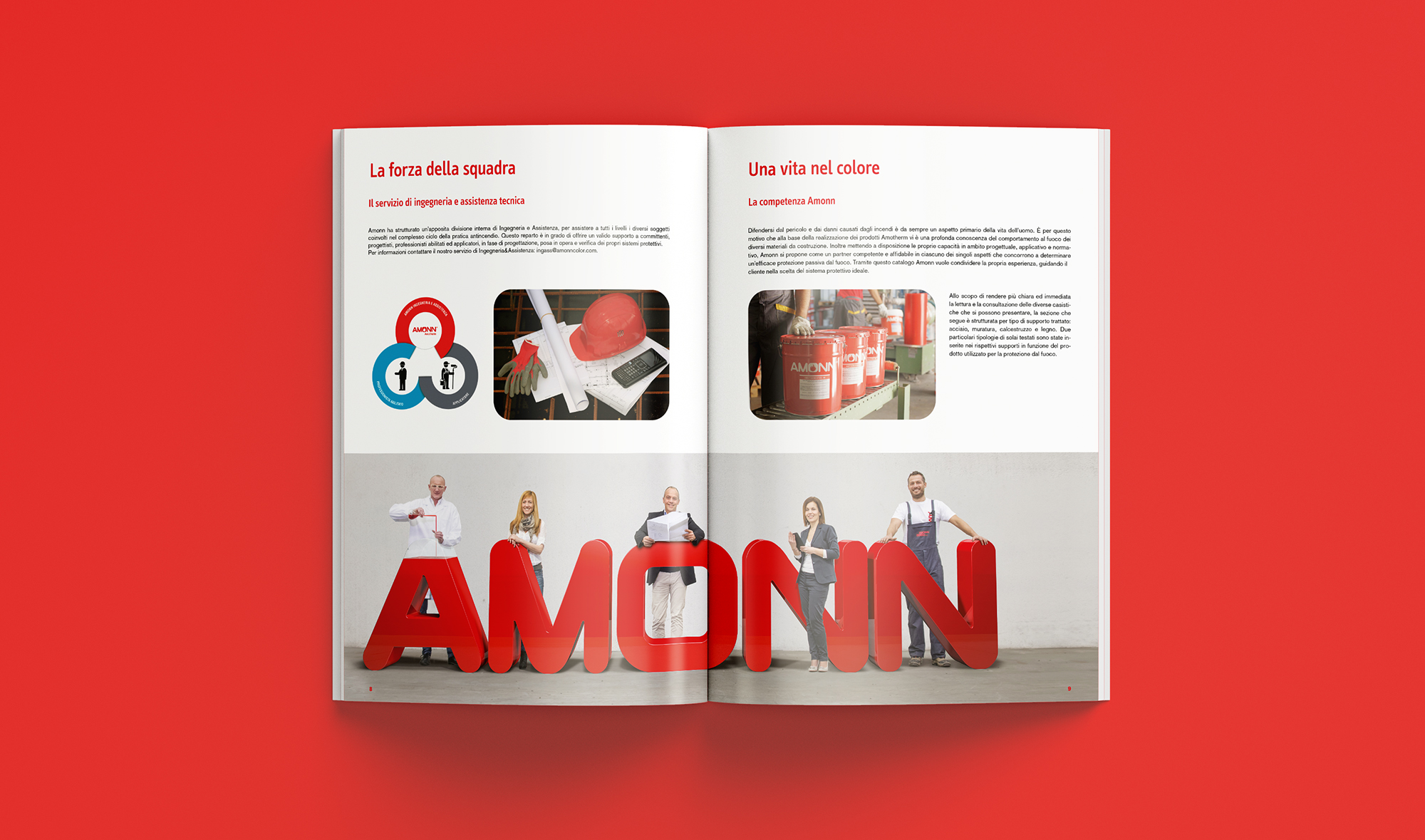
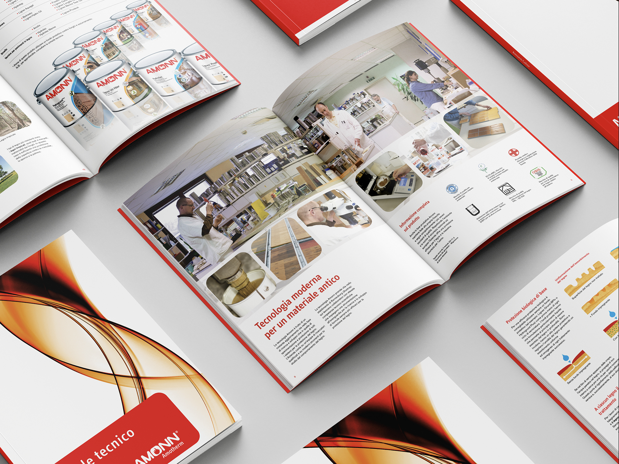
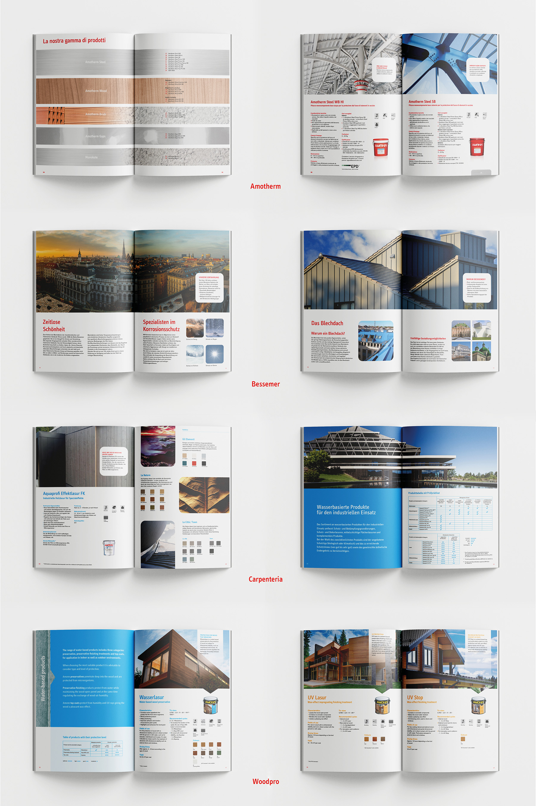
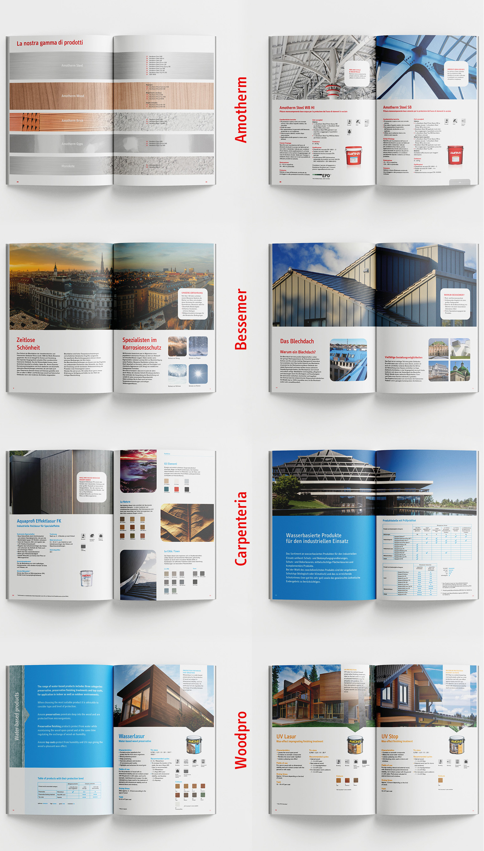
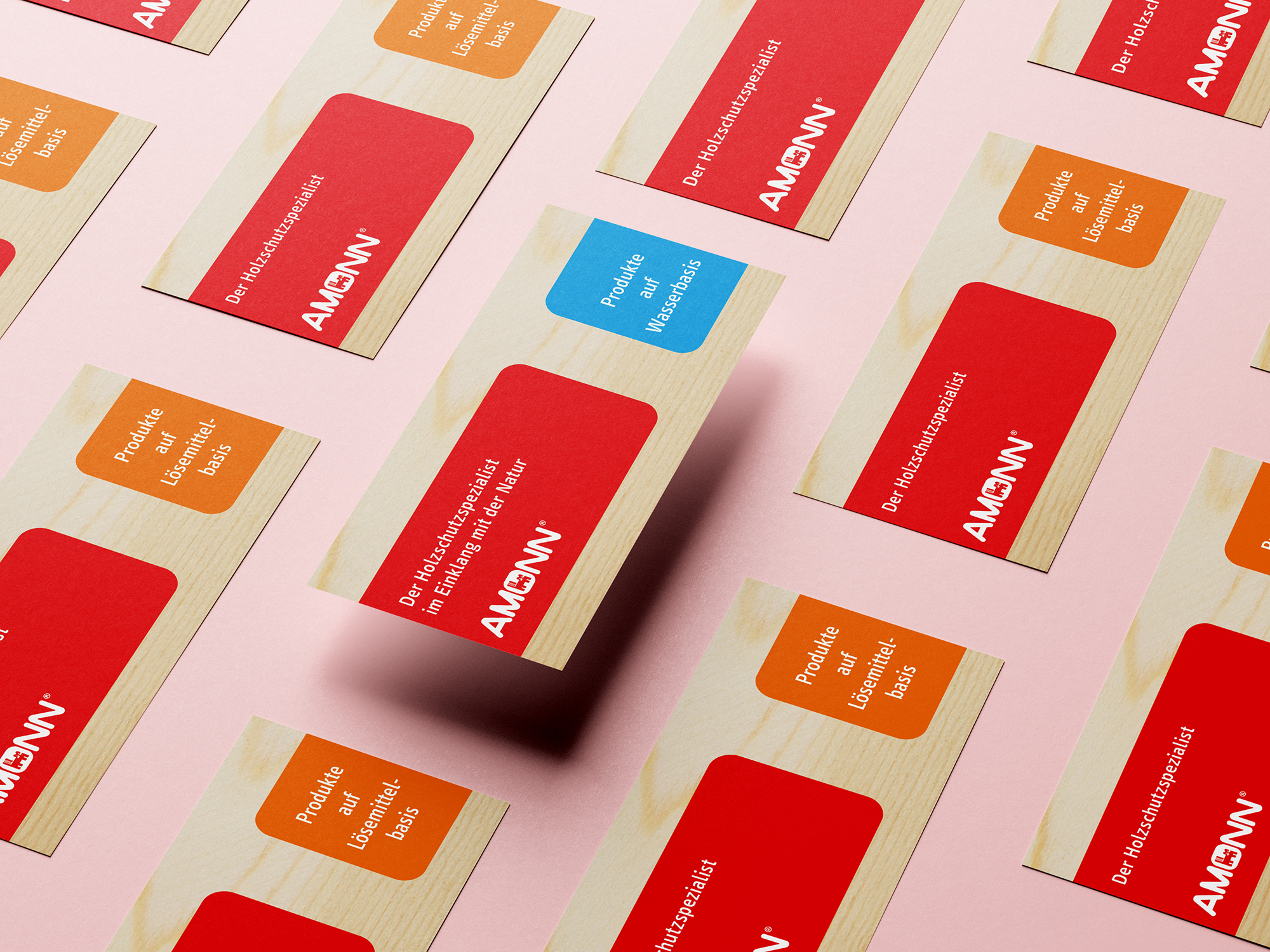
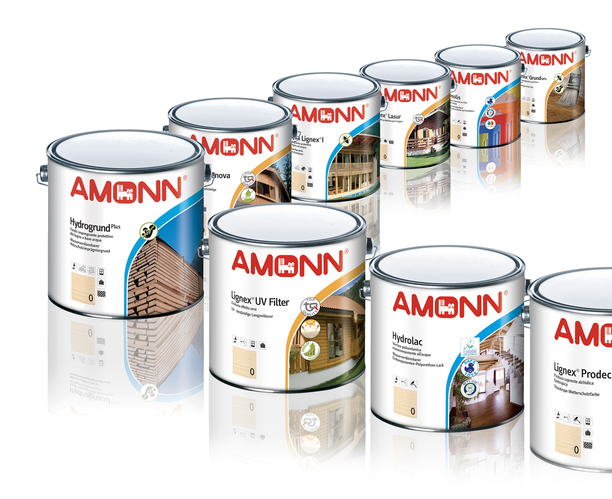
The objective in the design of Amonn Color’s brand architecture was to make its visual identity and communication more uniform, compact, and recognizable, regardless of format. To this end the project developed a unified color scheme, a fresh typeface, and an aesthetic of soft lines.
Amonn Color
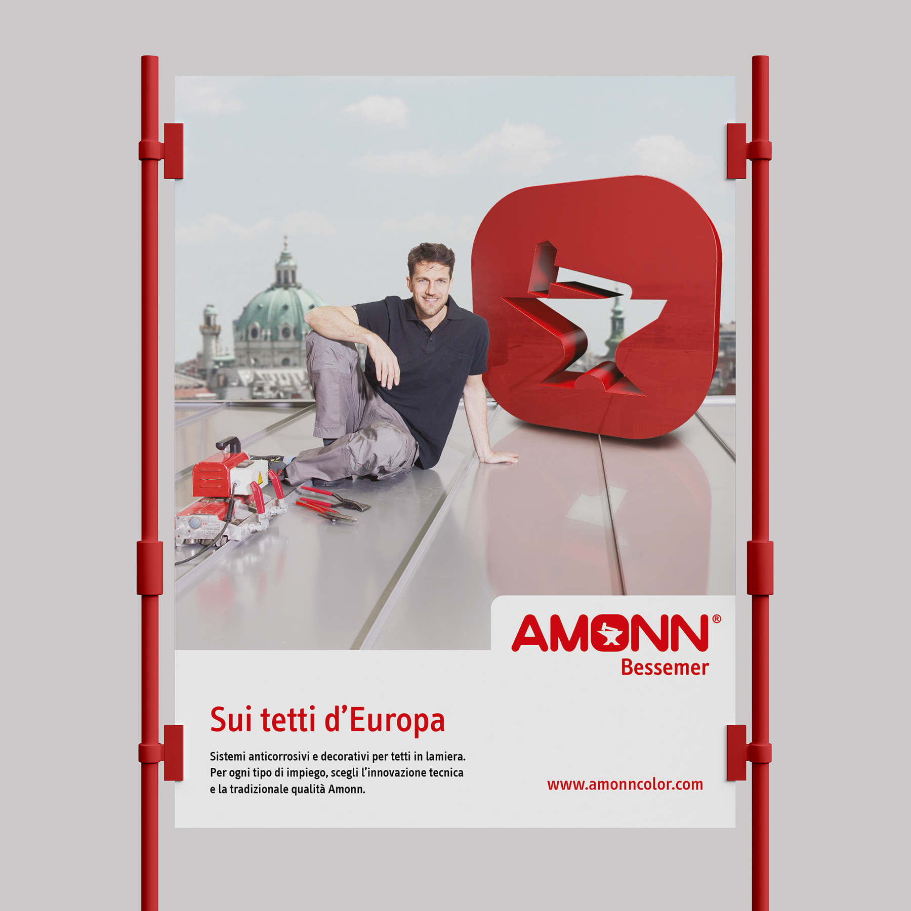
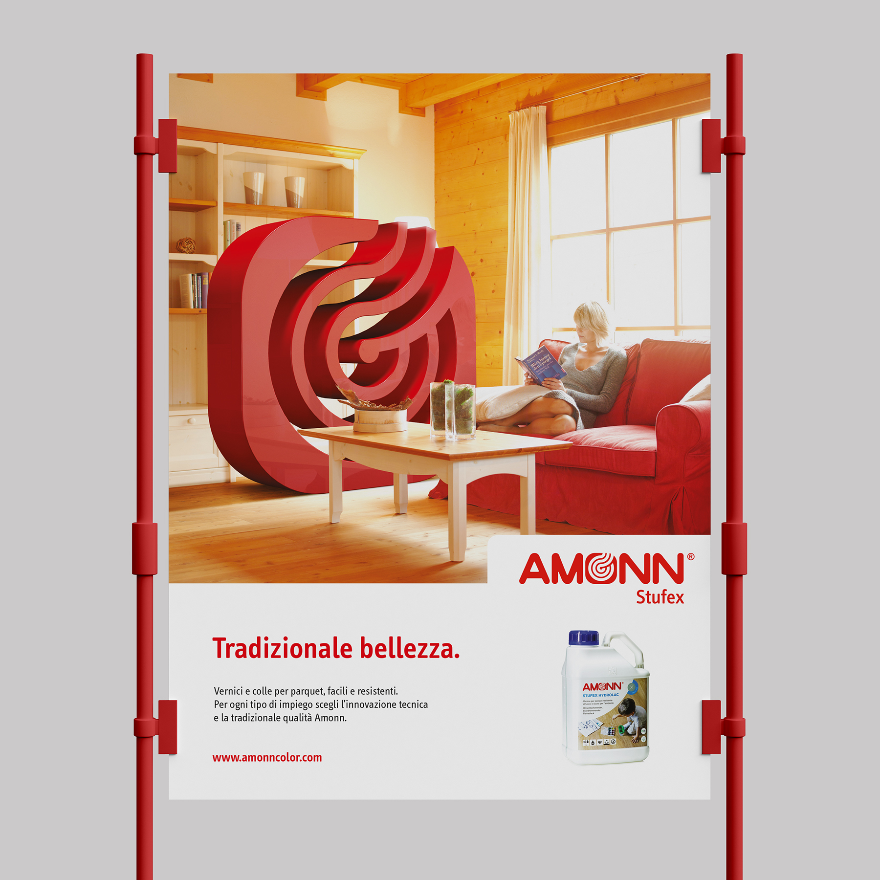
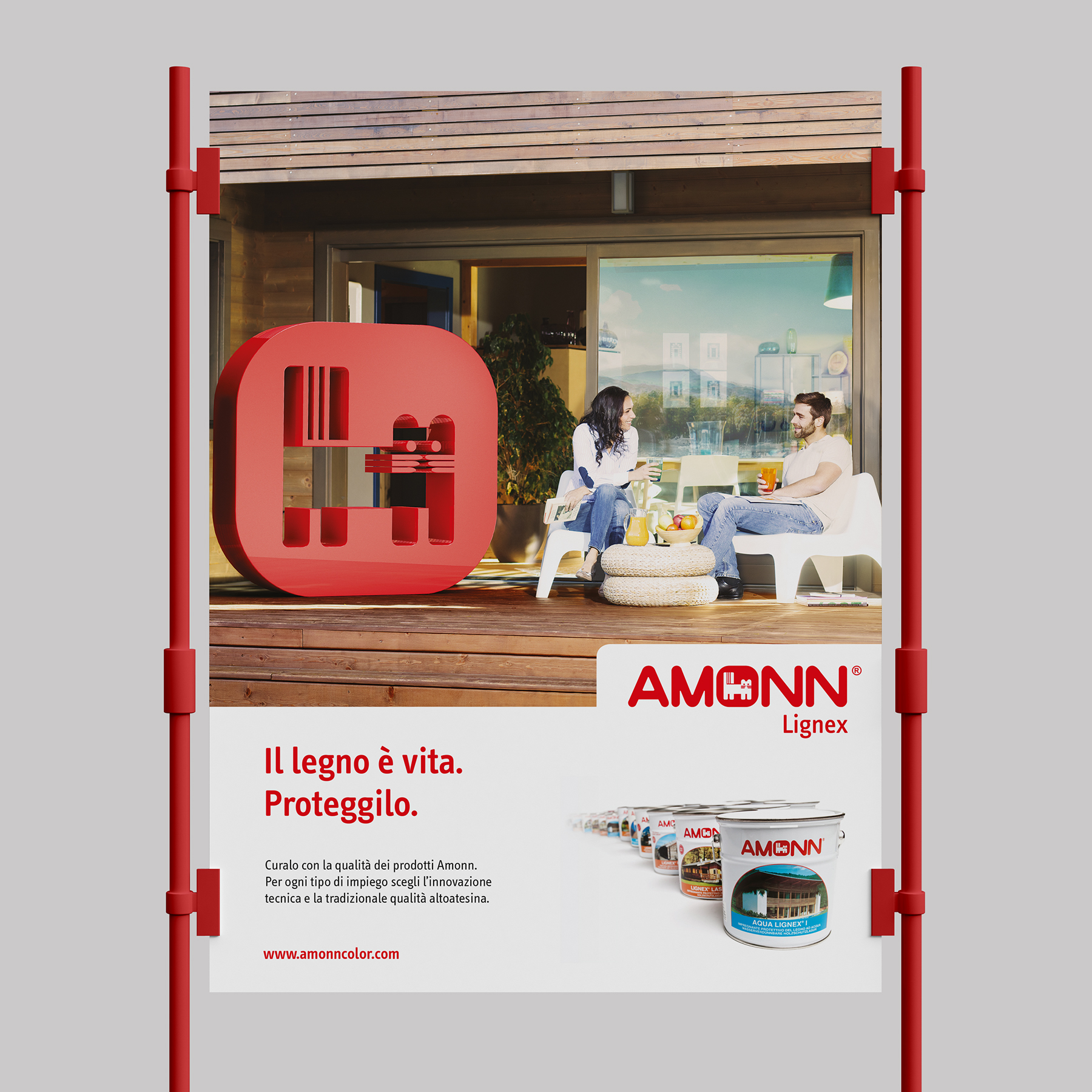
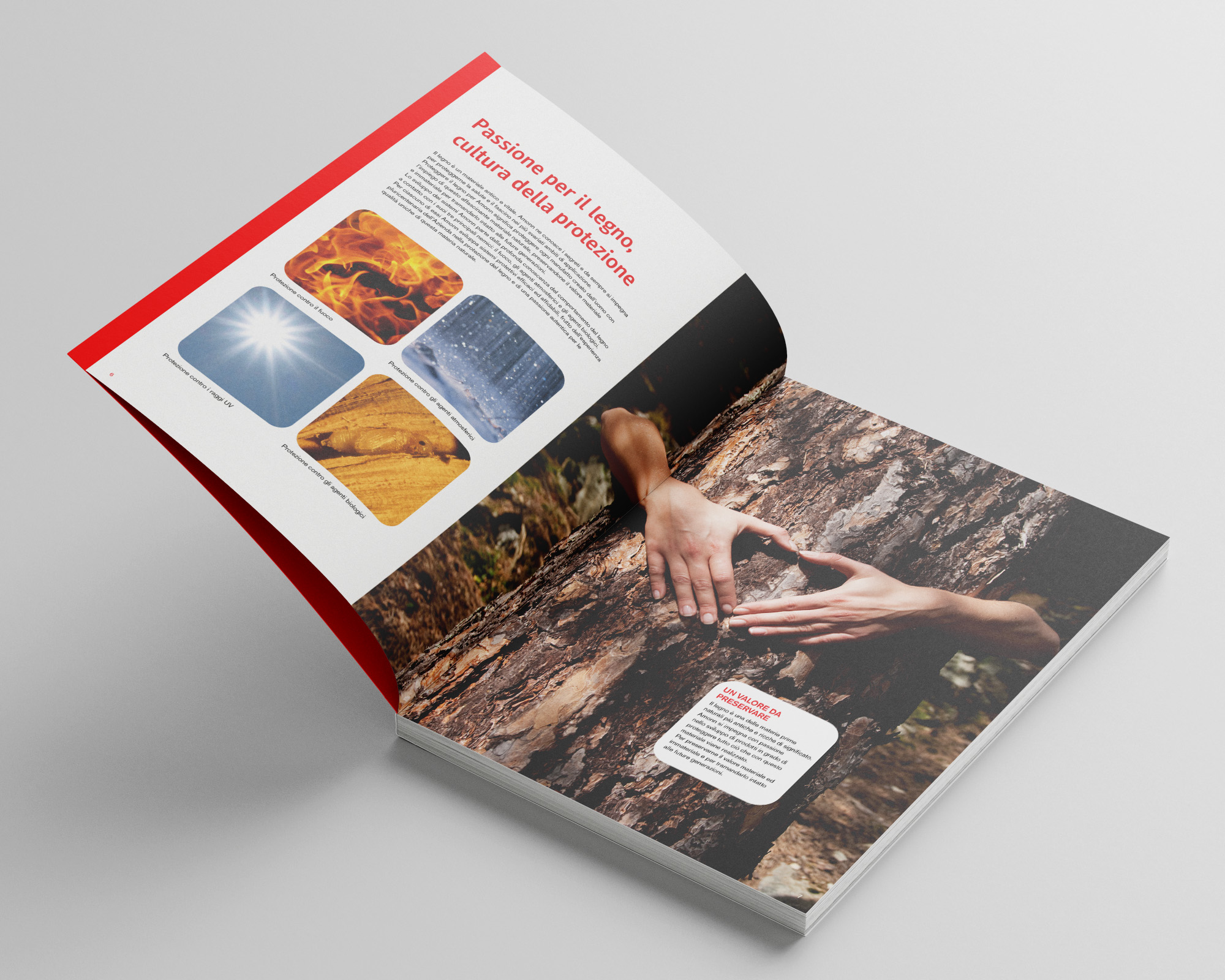
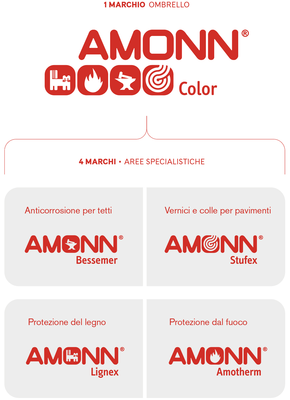
Amonn Color is an international company specialized in protective varnishes and paints. Its activity is articulated in four main areas: wood protection coating, flame control varnishes, anticorrosive substances for metal roofs, and glues and varnishes for wooden floors. Amonn is positioned as an innovative specialist in its field.
Discover more: amonncolor.com
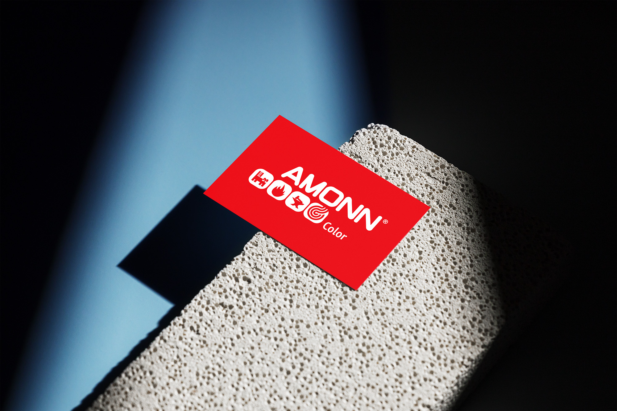
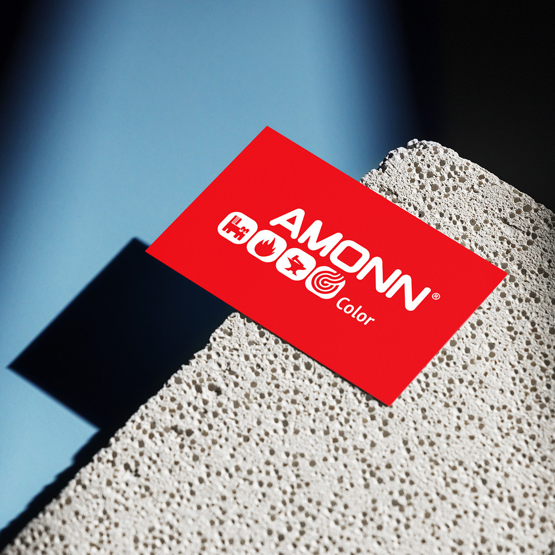
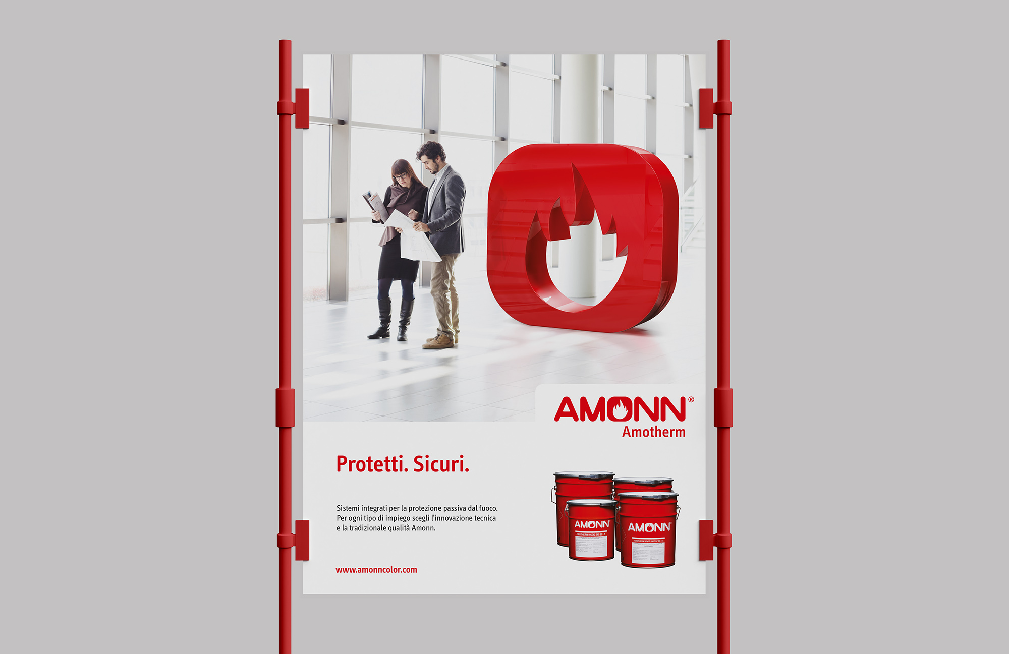
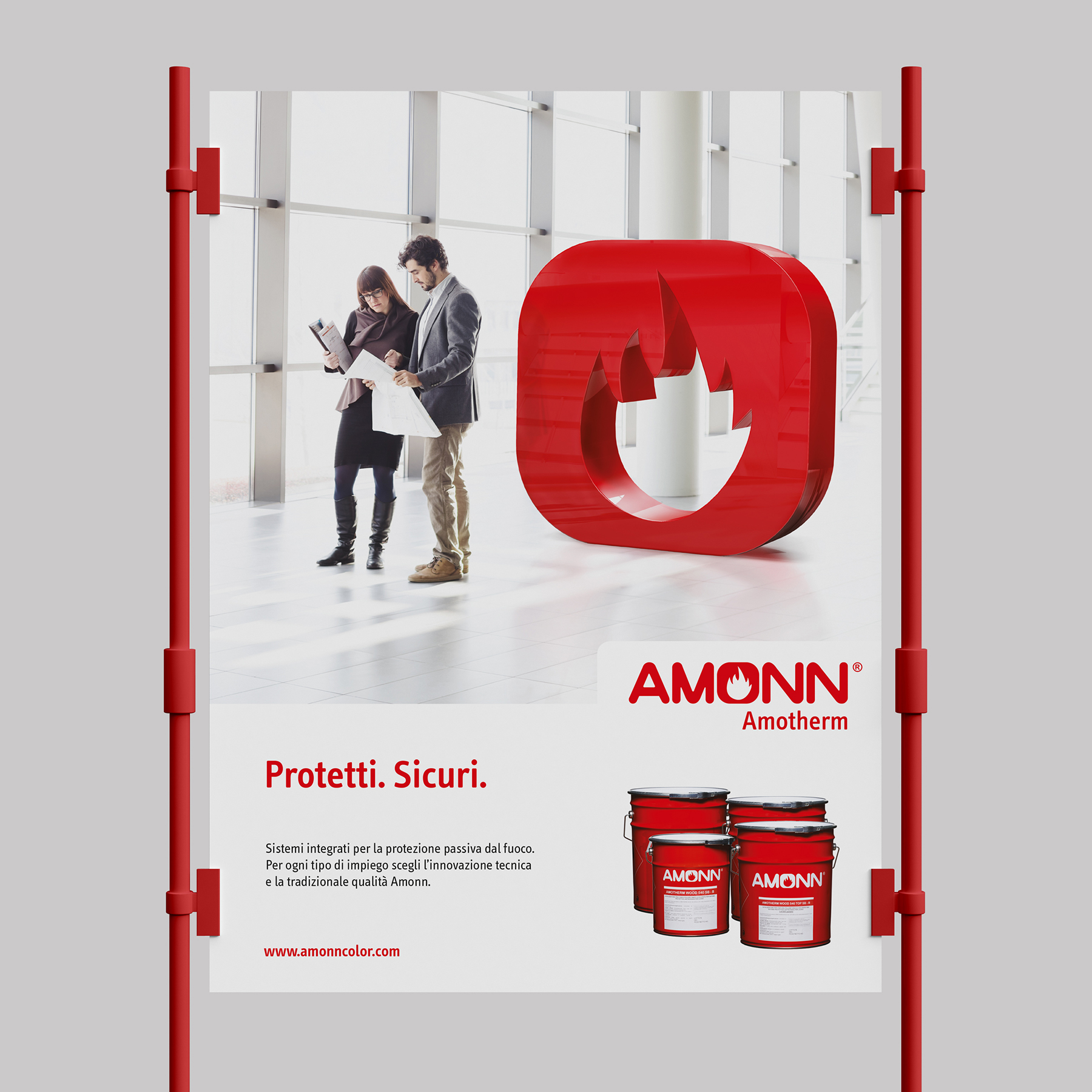
Four different pictograms have been designed for each brand of the specialist areas, which are inserted in the heart of the word Amonn, the letter O. The umbrella brand Amonn Color which includes the 4 lines, encloses all the pictograms in a dynamic and fluid composition. In this way it is possible to guarantee company recognition and to identify the features of each production line.